About Daniel
I’ve been called compulsively creative.
Whether I’ve spent the day creating explainer animations of proton beam therapy, editing a testimonial video for a local day care, or illustrating crazy hijinks for an animated character’s Instagram page, at the end of the day I’ll pull out a sketchpad to practice gesture drawings or work out a logo design I’ve been mulling over.
I’ve also been called a wizard… but that just makes me happy. #ChildhoodGoals
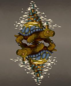
Above: Special K — Simone Biles concept animation
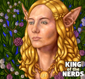
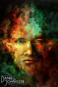
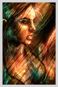
Left: Self portrait — Digital painting
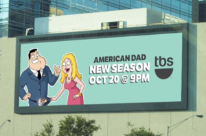
Below: American Dad — Social content illustration
get to the heart of the story
When I first transitioned from freelancing to agency life, my Creative Director was obsessed with finding the essential “nugget” of every creative piece. Each piece has a specific story to tell or goal to accomplish. Everything else is window dressing.
This insight completely reshaped the way I approach not only my career, but my personal work as well.
In an ideal world, we have unlimited time and resources to achieve perfection. The harsh truth is that we and our clients only have limited time, money, and patience. Understanding and communicating the heart of a concept is essential to the success of any creative endeavor.
Portfolio
Over the years, I’ve discovered that simply presenting a demo reel does not effectively show the diversity of my work and my role in its creation. So instead, below is a portfolio of some of my favorite creative pieces, along with some context and explanations for how they were accomplished.
Diverse Content Creation
Being compulsively creative is a blessing and a curse.
One of my biggest challenges is that I’m always finding new mediums and methods to incorporate into my work. For a while, I was worried that I was spreading myself too thin. Then, I took a step back and realized that each of these talents complements the others.
Developing an understanding of traditional oil palette mixing makes me better at color grading. Practicing 3D modeling teaches me to better illustrate objects in perspective. Staging is just as important in animation as it is when directing a live action production.
By learning a wide variety of styles and techniques, the body of my creative work has improved.
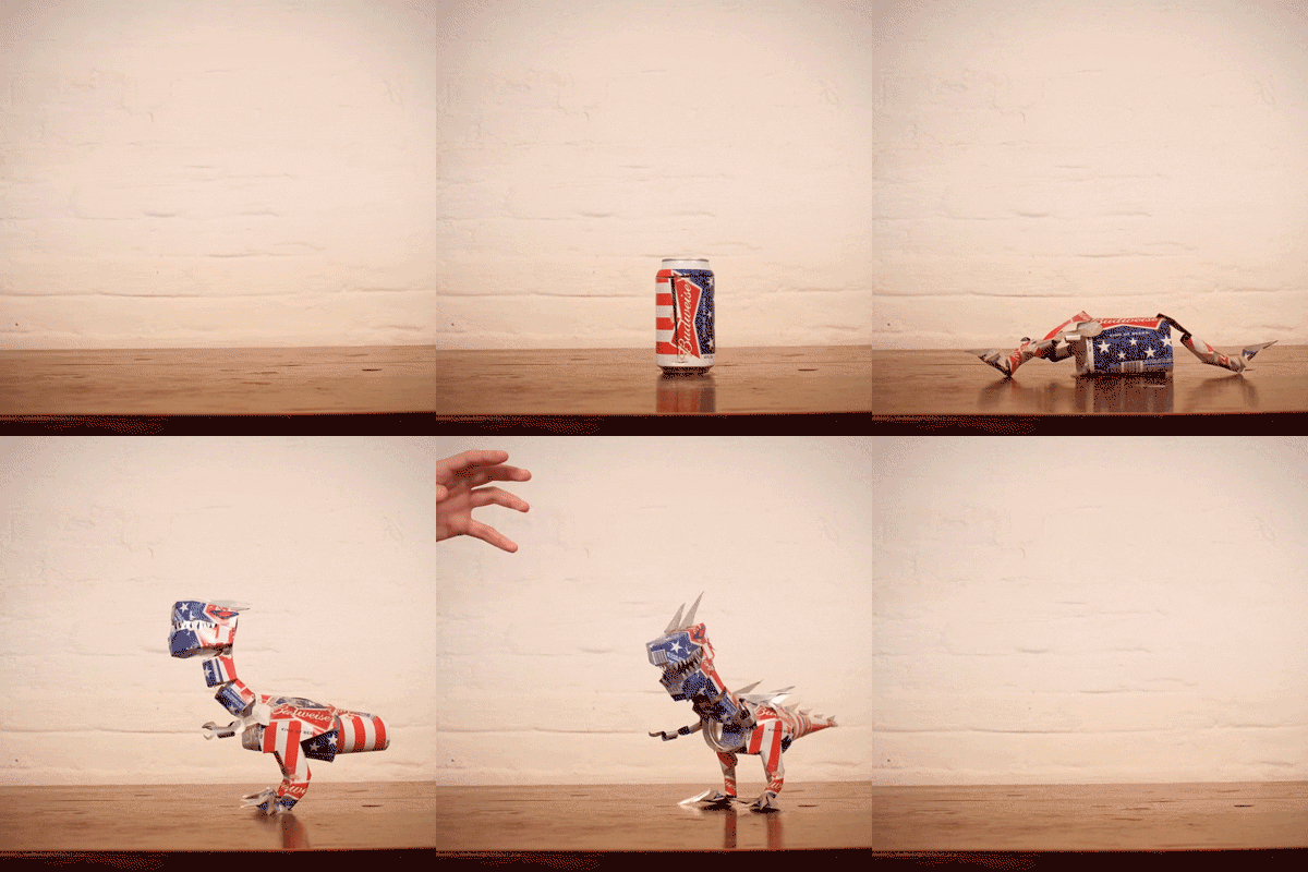

Top: Budweiser — Designed and animated stop motion can dinosaur.
Bottom: TBS — Social content, end card motion graphic.

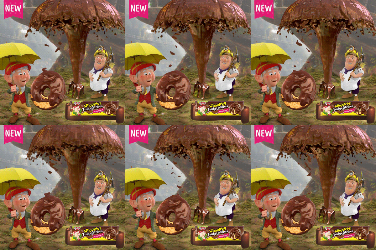
Top: Jack Daniel’s Tennessee Fire — Live action, 2D and 3D composite.
Bottom: Keebler — Fudge Geyser liquid simulation.
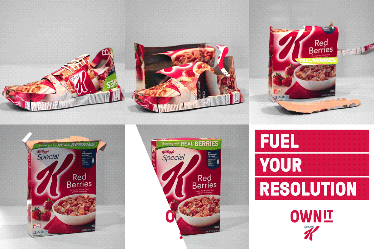

Top: Special K — Designed and animated stop motion box running shoe.
Bottom: Allstate — Vector rendered traditional drawn animation.

Above: Cheez-It / Pringles — 2D and 3D animation and compositing, with vector rendered traditional animation for MLS stadium kiosks.
Text and Imagery
I love this piece because it’s a traditional kinetic text motion graphic at its core, but it’s combined with vintage poster illustrations. It manages to be both ornate and gritty and enhances the poem with relevant imagry.
Fox Sports — This concept was developed by my friend and fantastic Motion Designer Craig Bragg. I was responsible for about 65% of the asset creation, 80% of the animation, and bringing it all togeather for the final edit with the poem and music.
Just Get Me a Spotlight
Tequila is not traditionally associated with basketball, but when March Madness became a popular conversation among Hornitos’s target demographic, we needed to move quickly to create relevant content for the trending topic. Due to the fast turnaround, getting access to a basketball court wasn’t possible. Instead, using just a rim, dramatic down lighting, and some 3D compositing, I shot this piece in a 12’x12′ room.
Hornitos — Live action shoot, stop motion animation, 3D animation, compositing and post production.
Reality? No Problem
After this concept was written and approved, our creative team struggled to plan its execution in a way that was safe and manageable. I was brought onto the project to help resolve the technical challenges of shooting a golf ball bouncing off a roof and rolling down gutters.
The issue was that reality was getting in the way. So, I picked up some gutter parts, shingles, and a garden gnome. I got all the shots I needed in my backyard with natural lighting, but from the safety of the ground.
Allstate — Live action shoot, compositing, 3D animation, post production.
Toast My Heart
Growing up, I spent a lot of my summers around campfires and cookouts. I don’t like to include a lot of pitch work in my portfolio, but this little looping love story I made for a graham cracker company really resonated with me.
The biggest challenge here was creating the heart-shaped marshmallow and in-betweens using a toaster oven and a lighter. It’s harder than it looks!
Spec Work — Stop motion animation, compositing, post production.
Origami FX Breakdown
This 6-second Vine video had a same-day turnaround, which can be a challenging time constraint for any 3D project. This video breaks down exactly how I completed the project to create a clean, polished look within just a few hours.
To achieve a realistic result, I focused on getting solid shadow and reflections, so it would look like the origami was being folded within a physical environment. See below for more details.
Allstate — Environment shoot, 3D animation, compositing and post production.
Reference material is everything. By taking an extra few minutes to shoot the scene with stand-in objects for compositing, I saved time and energy later because I could quickly pull up an image and double-check how the shadows should fall.
Staying flexible is also important. I started this piece with a plan to make the origami house out of construction paper, but in execution it felt too disconnected from the stack of bills, which weakened the concept about a home developing value. By making a new empty bill texture, I was able to keep the same dollar bill look on the paper throughout the video, without any distracting words or numbers visible on the origami house.
Developing 3D Styles
We’d all love to have the time and budget of a feature animation studio, with the ability to spend weeks on just 6 seconds of animation, with a server farm to render massively detailed texture and hair simulations. The simple fact is that when you’re balancing multiple clients, with projects that need to be out the door, you have to find ways to make high impact content with low poly models and a minimal amount of fancy textures and rendering.
Below: Juicy Fruit – 3D modeling, animation, compositing and postproduction.
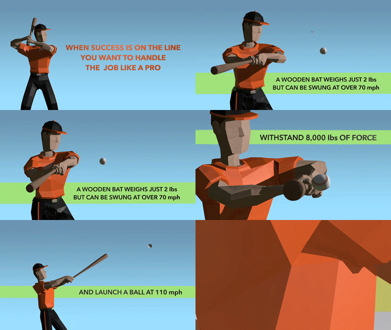
Very Low Poly
In this video, I used very large polygons with just enough differentiation to animate without losing the form of a baseball player. In contrast, there’s a lot of smoothing on the baseball so I can push the deformation of the impact.
Hitachi — Modeling, animation, post production.
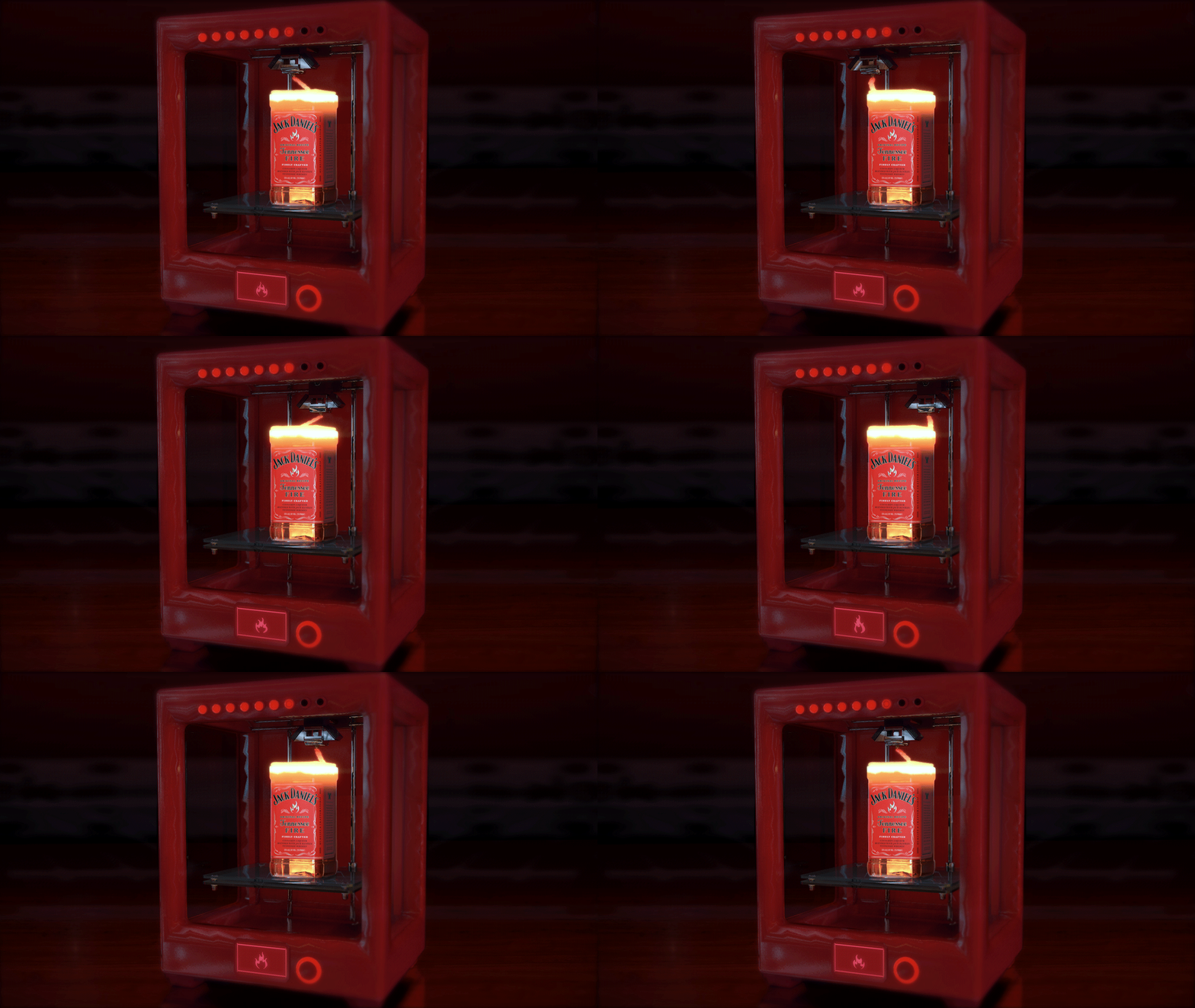
Photo Texturing
Labels and even bottles of liquid can be quickly rendered by getting the right look to a photo texture and wrapping it around a simple object. For this GIF, I used rendering power for a small fluid symulation and some glowing molten glass.
Jack Daniel’s Tennesee Fire — Modeling, texturing, simulation, animating, post production.
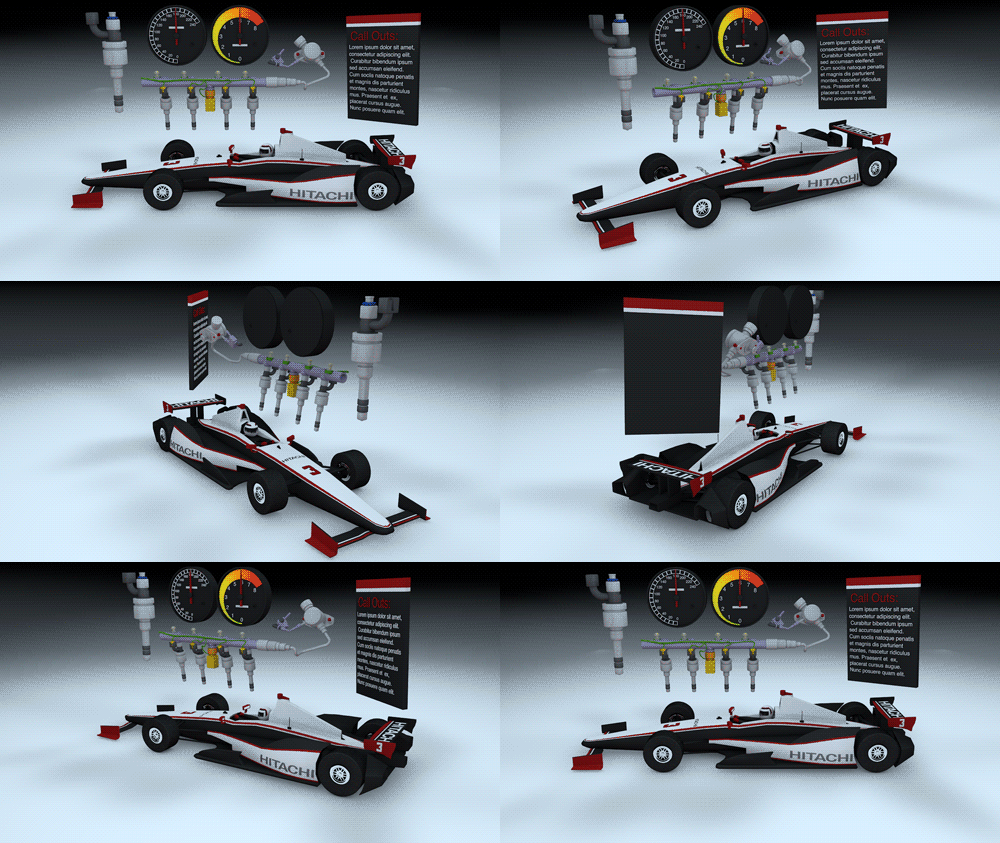
Simple But Specific Textures
Sometimes you need an object to look just like something from the real world, like the race car that Hitachi sponsors. When I’m working fast, I stay very aware of my polygon flow, so I can quickly add sweeps and blocks of color without a lot of texture painting.
Hitachi — Modeled assets for direct fule injection animation.
There are always multiple ways to complete any task. There were several ways I could have acheived this blueprint style in Cinema 4D. Whether I use the Sketch & Toon post effect, or model sweeps along poly vertices, depends on the type of control I need and the render times for the scene I’m developing.
Simple texturing styles can have a huge impact. By using the same basic car model but switching the style of texturing, I created a separate video with an entirely different feel that was still appropriate for Hitachi’s content family.
Adding a Personal Touch
Most of my work for Hitachi explains their complex technology, but for this piece they wanted to demonstrate how the Internet of Things (IoT) impacts a variety of industries. In our original concept, we planned to show a city on a Lazy Susan, with IoT icons popping up as we rotated through different industries, but it lacked enough dynamism to draw the viewer in. To add a personal touch, I developed a story about a manufacturing worker who visits the doctor and takes public transportation to meet up with his coworkers in the park, while IoT helps everyone along the way.
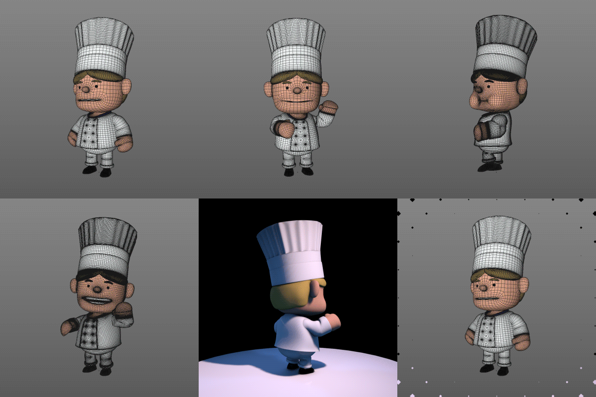
I had been tinkering with a low poly chef character who turned out to be ideal for this project. He’s built in such a way that I could easily remodel him to create a complete cast of characters very quickly.

Low Poly or Smoothed
These little guys can be left low poly for faster renders or smoothed out for close-ups. Even though they aren’t the most complicated rigs, they have loads of personality and appeal, making them perfect for this type of production. Developing this type of asset even when I don’t have a specific plan for them is one of the biggest advantages to being compulsivly creative.
Advertising Design
While I primarily work on video, I’ve often been asked to help with still design projects. As a flexible team player, I’m happy to assist with whatever design challenge is at hand.

For this Facebook link post about tennis data analytics, I was asked to photo composite network wires into a ball. To make the image more realistic and execute it more quickly, I instead stuffed a real tennis ball with network cables and did a photoshoot, adding lighting effects in post production.
Hitachi — Photoshoot, light compositing, and clean up.

This Facebook link post was a preview for an extensive Hitachi infographic that covered technology being used across a wide variety of markets. We wanted it to be simple, but eye-catching. I used a vector illustration style to connect with the rendering of the infographic, but pushed it into 3D space to make sure it got noticed.
Hitachi — Vector illustration.
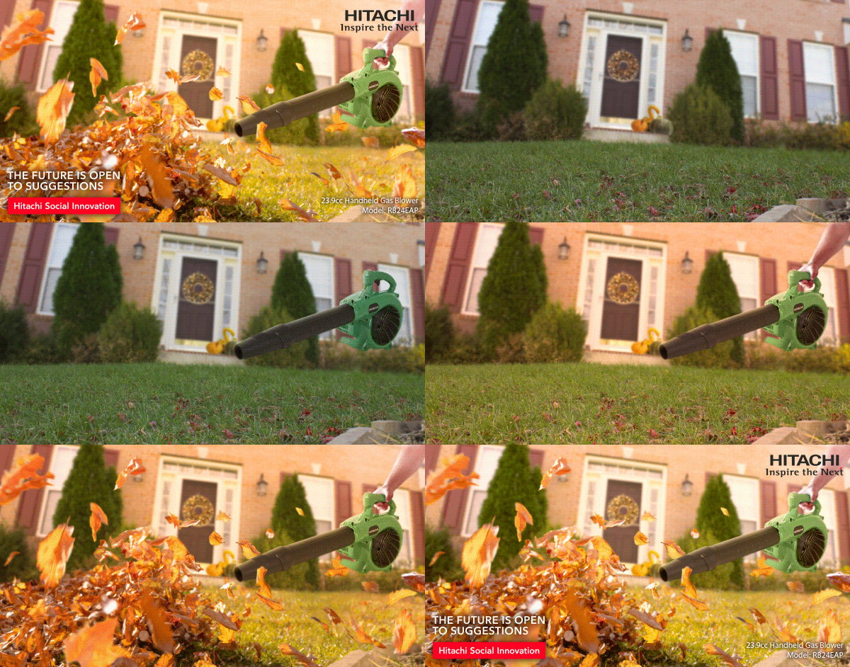
This process GIF shows how I created another post for Hitachi, which had a tight timeline and a specific product photo that needed to be incorporated. I did a quick photoshoot of a house and an arm and composited them together with the leaf blower. Then, I added a few fall elements subtly in the background. Last, I layered in the sweeping leaves to add motion and impact to the foreground.
Hitachi — Photoshoot, compositing, and color grading.
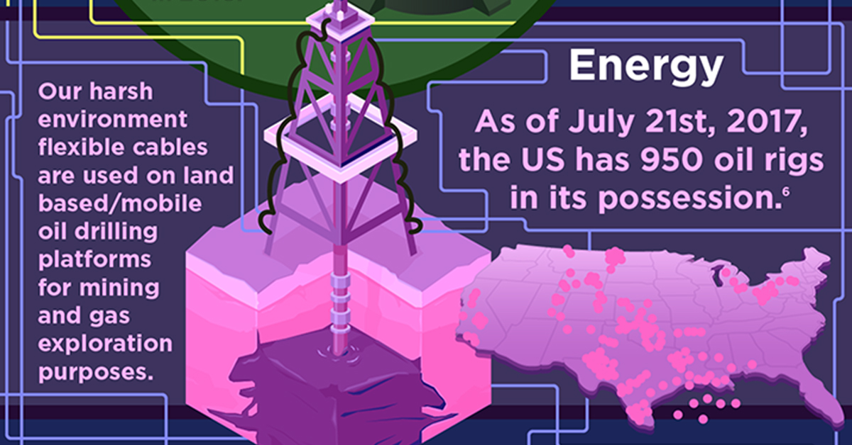
While I always prefer developing my own assets for any creative piece, I incorporated some stock images into this infographic to expedite its completion and meet a tight deadline. To integrate the stock elements in seemlessly, I used a consistent color palette and interweaving “cables.”
Hitachi — Vector composite and illustration.
Advertising Illustration
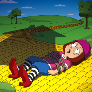
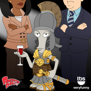
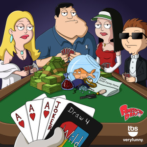
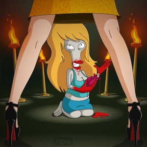
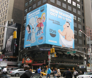
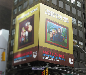
At Relevant24, I had the opportunity to create a lot of illustrated content for TBS, including work for an integrated traditional and digital campaign transitioning the popular show American Dad from FOX to TBS. The selected examples below I personally produced from concept sketch through finished piece, except for the billboards which were a team effort.
Science Fiction and Fantasy Illustration
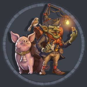
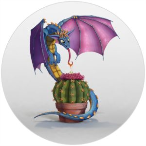
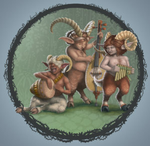
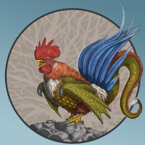
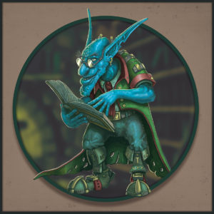
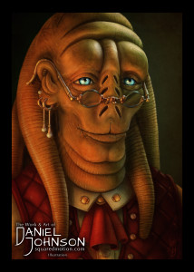
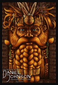
In my spare time, I illustrate sci-fi and fantasy art. While I consider this a relaxing hobby, I’ve completed some illustration commissions and published covers with independent authors. The skills I’ve developed through illustration have also benefitted my other creative endeavors.
One time, on a tight deadline for an American Dad illustration, I worked late into the night. When I finished, I sat back, stretched, opened a new Photoshop tab, and started a new illustration of my own—much to the exasperation of my wife, who exclaimed “You were just drawing for hours! How is that relaxing?!” I’m lucky that I get to draw and animate for a living, but sometimes it’s nice to just draw goblins, dragons, and elves.
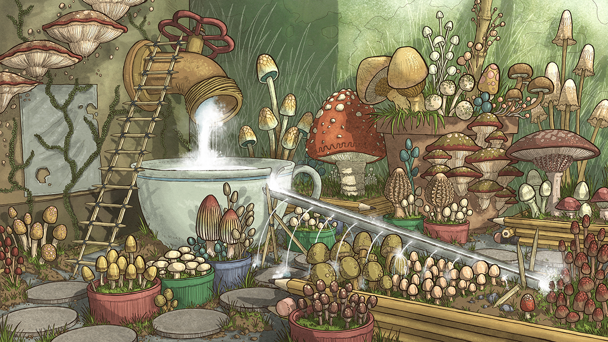
Below is a selection of my digital paintings.
Vector Illustration Posters


Get in Touch
As long as you are not a spam robot! No one likes spam robots.
Thank you for taking the time to check out my work.
Please feel free to reach out to me if you are interested in my services, have any questions, or just want to say hello!
Contact info
Northern Virginia / Washington DC.
+1 703 409 2883
daniel@squaredmotion.com


